Basic Digital Darkroom
When I took a good photograph I almost always trying to improve it using Photoshop: exposure, depth of field, black and white, duotones, blur and sharpness or even replace washed white sky with a nice one. In this article I will briefly describe my favorite ways to enhance the image:
- Contrast Masking
- Reducing Highlights
- Bringing up Shadows
- Sharpening
- Curves & White Balance
- Black & White
- Duotones
- Blur and Softness
- Vignetting
- Burn and Dodge
Contrast Masking
Sometimes you take a shot when there is bright lit zones and deep shadows - a great deal of a contrast. Because of latitude of your film or digital sensor some details are lost or completely invisible. You can improve the situation by reducing the contrast and here is a good way to do it:
- Create a duplicate layer of the background layer
- Desaturate it completely (Image, Adjustments, Desaturate or you can use Channel Mixer with Monochrome setting "On")
- Inverse (Ctrl-I)
- Change blending mode of the layer to "Overlay"
- Set opacity from 10 to 60 (depends on your situation)
- Use Gaussian Blur (Filters, Blur, Gaussian Blur) with radius about 10-20% (again depends on your picture)
Reducing Highlights
If Contrast Masking reduces the overall contrast by reducing highlights and bringing up shadows, this technique does it for highlights only:
- Select the background layer
- Ctrl-Alt-"~" to select highlights
- Ctrl-J to create another layer with the selection
- Change blending mode of the layer to "Multiply"
- Change opacity of the layer as needed
Bringing Up Shadows
This method brings some details in shadows (opposite to reducing highlights):
- Select the background layer
- Ctrl-Alt-"~" to select highlights
- Ctrl-Shift-I to invert the selection (select shadows)
- Ctrl-J to create another layer with the selection
- Change blending mode of the layer to "Screen"
- Change opacity of the layer as needed
Sharpening
When you downsize an image there always is a loss of sharpness. To cope with this people use Unsharp Mask (USM) - Filters, Sharpen, Unsharp Mask. The simplest way is to use a large "amount", a small "radius" and tiny "threshold". A bit smarter way to use small "amount" but many times. Well, there is one more way - intelligent way:
- Create a duplicate layer of the background layer
- Select all the image (Ctrl-A)
- Copy to the clipboard (Ctrl-C)
- Go to Channel tab (behind the Layers)
- Create a new channel
- Copy the content of the clipboard (Ctrl-V)
- Apply: Filters, Stylize, Find Edges to the channel
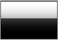
- Ctrl-L to open "Levels" dialog
- Move the small black triangle to the edge of the histogram (as shown below) and press OK
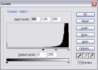 Levels Dialog
 - Click on the channel holding Ctrl (select those areas of the image that marked as black)
- Apply USM: Amount = 500, Radius = 0.2, Threshold = 0
- One more time: Amount = 280, Radius = 0.8, Threshold = 0
- Ctrl-D to deselect
- Return to tab "Layers"
- Change the opacity of the new layer as needed.
Curves and White balance
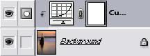
This method is working as for BW as for color photographs. For BW photographs I correct (improve) shadow-highlights tones and contrast. For color photographs I use it to correct white balance as well. The method creates an additional layer that controls colors/brightness of the image, to control only a certain layer you have to locate the layer above the layer, which requires corrections and press "Ctrl-G" (Ctrl-Alt-G in CS2) on the layer. The same curves could be used multiple times - read how. The picture below shows the final layer palette.
To correct white balance - use eyedroppers: black to select the black (darkest) point in the image, grey to select gret tone, and white to select the brightest point
Shadow-Highlights tones
I use shadow-highlights tones in terms of pure black and pure white (and may be pure gray) colors of the image. Sometimes (or I would say often) conditions and settings (e.g. exposure) are not perfect, so black colors look dark gray, whites as light gray or the image has some color cast. To make blacks as pure black and whites as pure white I use curves:
- Main menu: Layer, New Adjustment Layer, Curves
- Press "OK" button in the popup dialog
- Click on eyedropper icon with black point (the hint for it is "Set Black Point")
- Click with this eyedropper on the image where the color should be pure black
- Click on eyedropper icon with white point (the hint for it is "Set White Point")
- Click with this eyedropper on the image where the color should be pure white.
- Optionally perform the same steps for gray color (gray point)
Some people suggest choosing color only for the main subject, but I think it depends on the image and what results you want to achieve. So, play with it and do as you think is best for your image.
~ Top ~Color Cast
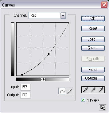
For color photographs the steps described above work and will change color cast as well, but there still could be some "leftovers" in color cast that need to be corrected. Or if you want to add some warm colors or change the white balance you still can use the following steps:
- Main menu: Layer, New Adjustment Layer, Curves
- Press "OK" button in the popup dialog
To add/remove color cast:
- Select color in the upper dropdown list (e.g. Red, Green, Blue)
- Click on the curve line and drag the point to change the balance
You can drag end points as well to shift the whole line. You can make several points on the line to make
a curve (e.g. "S" shape) and change color cast either in highlights or shadows by modifying only part of the line.
Example:
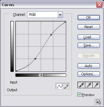
To add/reduce contrast of the image
- Select the whole gamma of the colors (RGB)
- Make an "S" shape curve by dragging two or more points.
The steeper the curve the more contrast the image is.
Example:
Black & White
Recently I've begun to incline to black&white photographs. BW photographs can easily reflect mood (subject and color tones) and as well they resemble those pictures in art museums and exhibitions. But for creating a good BW photograph from color we can use different approaches, which depend what results we want to get.
Approach I (Image, Calculations)
Usually when I want to get a contrast image without color filtering (as it could be done in film photography) I use the following method:
- Main menu: Image, Calculations
- Select channels to use (Red, Green, Blue) for the sources
- Set blending mode (usually Multiply, Lighten, Soft Light)
- Change Opacity (depends on the image)
- Press "OK" Button
- Main menu: Image, Mode, Grayscale (to make a BW image)
Rarely would I use the Mask option, you could try this option and decide when to use it by yourself.
Approach II (Image, Adjustments, Channel Mixer)
When I want to apply "filter" (e.g. red filter to blacken the sky) I use Channel Mixer, and the steps are the following:
- Main menu: Image, Adjustments, Channel Mixer
- Check "Monochrome"
- Slide the bars (e.g. Red to the right, as if for the red filter). But remember that the overall sum of the values should be close to 100%, small deviations will either lighten or darken the image.
- Press "OK" button
Approach III (Image, Mode, Lab Color, Lightness)
If modification described above results in higher grain and noise I would extract lightness information from the image, which doesn't relate to colors. The procedure is the following:
- Main menu: Image, Mode, Lab Color
- Go to the channel palette
- Delete the channel "a" (then the palette will have two alpha channels)
- Delete the second alpha channel ("Alpha 2")
- Main menu: Image, Mode, Grayscale
Approach IV (Desaturate)
- Ctrl-Shift-U or Main menu: Image, Adjustments, Desaturate (Actually, I didn't here see any difference from simply Mode, Grayscale - next one)
Approach V (Grayscale)
- Main menu: Image, Mode, Grayscale (the result as in the previous one)
Duotones
You can add mood to BW picture by using Duotones. Actually there are more than two tones that you can add. Duotones can be added only to images in Grayscale mode:
- Make sure that the image is in Grayscale mode (Image, Mode, Grayscale)
- Select Duotones (main menu: Image, Mode, Duotones). You will see similar to the following window:
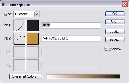
- Select Duotone, Tritone, Quadtone to work with two, three or four colors.
- Click on the color icon to select color for the tone.
- Click on the icon with the curve to change color output values.
You can modify the values at any time by repeating the procedure from the step 2 or load some of the stored ones (and save your settings).
Blur and Softness
To add softness to the picture I use Gaussian Blur filter. This method will not remove the focus, it actually reduces acutance by diffusing the image.
Here is how I apply this method:
- Duplicate the layer with the image (put it atop of the original level - by default)
- Change the opacity of the new layer to 50%
- Apply Gaussian Blur with radius set from 3 to 12 pixels
- Change opacity of the new layer if needed
Vignetting
For some photographs it is good to have corners darkened, so the eye will be attracted to the center of the image, and will not leave the frame. I apply vignetting using the following steps:
Black Approach:
- Create a new layer atop of the stack
- Fill it with black
- Apply eclipse marquee to the layer, so only the corners are left
- Invert selection Ctrl-Shift-I
- Create Layer Mask
- Apply Gaussian Blur to the mask with Radius 200-250px
- Change opacity of the layer as needed
- Use Brush to lighten/darken some areas (corners) of the layer as needed.
Brightness Approach:
This approach requires some skill of working with masks.
- Create a new adjustment level "Brightness/Contrast" atop the layer stack
- Set the brightness -70..-90 and the contrast +5..+15
- Make sure that the mask it the current editable area (click on the white rectangle next to the icon of the brightness/contrast layer)
- Select an eclipse area to include the main subject or it main feature
- Ctrl-Alt-D to set Feather as 50..250 (depends on the image size)
- Fill-in the selected area with black color (Alt-Backspace - to paint with the current foreground color)
- Change opacity of the layer as required
Burn and Dodge
For even further attraction of the eye and emphasizing mood and subject of the picture I use
Burn and/or Dodge tools to darken/lighten areas of the image. Apply the tools to another new layer,
atop of the basic image layer, so you can undo the whole changes. As well you can use brush with
blending modes Darken/Lighten (or some others) applied to the separate layer.
![[end of the text]](http://www.romanzolin.com/img/misc/text_end.png "End of the article")

- Font size:


