Graphics In Photography
In this article I want to tell about graphic elements in a photograph and how and what effect they bring. The composition of a photograph, as I see it, has most important meaning and effect on the final result and impression. The graphical elements are the bricks of the composition.
Frame
 In one of my previous articles I briefly described that the frame
itself has a certain affect on the photograph. First of all the frame
is the border between the world of the photograph and the reality.
The frame confines the whole world and affects it with its shape. A rectangular frame is most usual for our eye and
easily goes through our mind, but if the form of the frame is different
then the photograph becomes unusual for us as well and we consider
the content of the photograph somehow differently. The main point
here is not to overdo the frame, finally it is only the frame. I must
add that there are two main form of frames: portrait (vertical) and
landscape (horizontal). We see the shapes every day or even every
minute - paper, books, documents, doorframe, buildings etc. And our
eye accustomed to them, but the scientists have found that the portrait
frame is most appealing to our eye, that's why when you don't know
what orientation to use - select the portrait.
In one of my previous articles I briefly described that the frame
itself has a certain affect on the photograph. First of all the frame
is the border between the world of the photograph and the reality.
The frame confines the whole world and affects it with its shape. A rectangular frame is most usual for our eye and
easily goes through our mind, but if the form of the frame is different
then the photograph becomes unusual for us as well and we consider
the content of the photograph somehow differently. The main point
here is not to overdo the frame, finally it is only the frame. I must
add that there are two main form of frames: portrait (vertical) and
landscape (horizontal). We see the shapes every day or even every
minute - paper, books, documents, doorframe, buildings etc. And our
eye accustomed to them, but the scientists have found that the portrait
frame is most appealing to our eye, that's why when you don't know
what orientation to use - select the portrait.
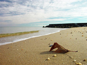
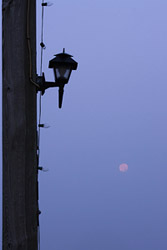 Another important point is to keep in mind that the
proportion of the borders plays
its own part in the photograph. Let's take for example a vertical view
of a photograph (as shown on the left image). This frame has a usual rectangular
shape placed vertically. Can you say why it is vertical? The answer
- because of the street lamp. It has a vertical shape and it is the
main subject of the image. And the frame supports the meaning by its
vertical shape, in this case the longest lines of the frame are verticals,
and they imply that vertical lines within the frame have more importance
than other lines.
Another important point is to keep in mind that the
proportion of the borders plays
its own part in the photograph. Let's take for example a vertical view
of a photograph (as shown on the left image). This frame has a usual rectangular
shape placed vertically. Can you say why it is vertical? The answer
- because of the street lamp. It has a vertical shape and it is the
main subject of the image. And the frame supports the meaning by its
vertical shape, in this case the longest lines of the frame are verticals,
and they imply that vertical lines within the frame have more importance
than other lines.
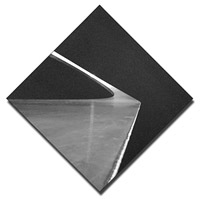
What about the embellishment of the frame, what border
to use? There is no certain answer to that. I tried to create different
frames and sometimes was too excited with the play that forgot about  the photograph itself, so beware. I am usually trying to complement
the photograph with the frame, so it would not distract, but to add
a kind of presentation view. My guidelines are: use primary color
of the photograph as the fill of the frame, support the photograph
with the frame in terms of style and content, environment where the
photograph will be placed (website, photo contest, forum, wall and
etc.) and don't make it too wide. Most of the photo websites use gray
color as the background for the published photographs. It is a good
decision, because the gray color serves as a complementary color for
all other colors, it is neutral. And in most cases it is enough, but
sometimes your photograph may require additional effort to do the
frame. Simple case - a few pixels of black around the image, or more
complex - canvas and shadow (see the image). To do it I use Photoshop,
some of such techniques are described in my article about creating
frames in Photoshop.
the photograph itself, so beware. I am usually trying to complement
the photograph with the frame, so it would not distract, but to add
a kind of presentation view. My guidelines are: use primary color
of the photograph as the fill of the frame, support the photograph
with the frame in terms of style and content, environment where the
photograph will be placed (website, photo contest, forum, wall and
etc.) and don't make it too wide. Most of the photo websites use gray
color as the background for the published photographs. It is a good
decision, because the gray color serves as a complementary color for
all other colors, it is neutral. And in most cases it is enough, but
sometimes your photograph may require additional effort to do the
frame. Simple case - a few pixels of black around the image, or more
complex - canvas and shadow (see the image). To do it I use Photoshop,
some of such techniques are described in my article about creating
frames in Photoshop.
A few words about the size - it mostly depends on the type of the photograph. Some photographs require more attention to details, others to overall feelings and composition. When the photograph is small and its accent is on details the viewer cannot see the details, that creates dissatisfaction and the impact is diminished. In such cases the bigger the photograph the better. When the composition is the main aspect, it could be recognized even in a small picture, but don't get too greedy for the size.
~ Top ~Eye
The eye is the main judge of our photographs, so it would be good to know how it behaves and what it likes or not likes, isn't it? Well, I don't know everything, but there are several moments, which I've learned so far and ready to share them with you. I will start from the basics, the eye first recognizes size, then color and then shape. It is subconscious behavior, but we can keep it in mind and use for our benefit. Another point - the way our eye moves through the image. Most people read from the left to right, and the same our eye moves from left to right through the image. But this movement has more parameters and conditions, one of them is the what obstacles or help it receives along the way. The eye easily travels along the lines, and the effect of converging lines is based on this. If there is a line that goes across the eye's path it becomes an obstacle. At that moment the eye has to decide what easiest or most interesting direction to choose. The angle of crossing the lines will affect the "easiest direction" choice, and contrast areas will be more interesting for the eye as well. The contrast areas are another point of my article and will be covered a bit further.
 Based on how the eye travels we can set a certain path for it to go
through the image. The ideal way for the photograph is that the eye
easily goes into the
image, and as long as possible stays within the frame. To bring the
eye into the frame photographers often use lines that begin from the
frame border and lead into the image (better if it will start from
the left - remember the direction of eye's travel).
Based on how the eye travels we can set a certain path for it to go
through the image. The ideal way for the photograph is that the eye
easily goes into the
image, and as long as possible stays within the frame. To bring the
eye into the frame photographers often use lines that begin from the
frame border and lead into the image (better if it will start from
the left - remember the direction of eye's travel).
But how make the eye stay within the frame? I would answer - interesting
objects. Because the goal why you brought the eye into the frame is
the main interest of your photograph and the eye should stick to this
interest point, where our brain then can play with the subject. There
is another approach to make the eye stay within the frame borders
- make it travel along the lines within, so it will be busy all the
time. This approach works best with abstract images (i.e. architectural)
where are many lines and many ways to explore.
Well, let's go back to contrast areas, which I mentioned a few lines
before. The contrast areas very easily attract the eye, and it is
good to know, but sometimes if you forget about it, it works against
you. For example, I made a good portrait (the face is the main point),
but forget about the hand, which is the contrast area. It makes the
eye to hesitate between the decision where to go (the face or the
hand).
Finally, in the conclusion of this section I would say that if you can combine the interest and contrast in the subject and bring the eye to the point - you made a very good photograph.
~ Top ~Lines in the frame
I just said "something" about lines and the eye. Oh, yes. The path of the eye, but there is another side of the coin - how the eye perceives the lines.
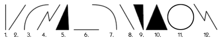
The image above represents some basic lines we use in graphics and photographs as well. Each of these lines has a certain meaning that is perceived by our mind. Below I will try to translate it into what we may digest from it:
1. Vertical line
It is well balanced but has some tension and growth. In my mind it associates with a tall building (skyscraper), which is stable enough but can be toppled over.
2. Diagonal line (left bottom to right top)
The main point here is the dynamic. The line represents a stable growth or positive dynamic movement. The straight line still implies a certain level of tension.
3. Curve diagonal line (left bottom to right top)
As any diagonal line this curve implies dynamic, but because of the smooth curve there is not much tension. But if you associate it with a stem of a flower under the wind, you can image some tension at the top tip of the curve.
4. "Broken" diagonal line (left bottom to right top)
This example has two corners, but in real life such lines may have many corners and even it implies growth, there is too much tension. Closest association is a lightning or sharp teeth, which bring aggression and fear.
5. Triangle based on the side (diagonal from left bottom to right top)
This is a simple shape which is created by three lines. The proportion between its height and width suggest that it stable enough but could be toppled over with a small effort. The diagonal line brings all the meaning you can extract from the point #2 in the list. The top corner suggests tension and sharpness (depends on the angle). The meaning of the colors will be covered later in the article.
6. Horizontal line
It is probably most stable and peaceful graphic element of the whole set. What could be more stable than such a line? Where is the tension? My first association is the horizon line, which implies the Earth.
7. Curve diagonal line (left top to right bottom)
It is very similar to #3 but it has some descending moment. And I see some degradation in here. But still there is a bit of tension, which is diminishing to the right bottom end.
8. Diagonal line (left top to right bottom)
Another diagonal line (as in #2). And here again this degradation element, which adds some negative feeling. But this negative feeling mostly when you consider the line alone (without the content it is in). The line has the same meaning (except the degradation) as in #2.
9. Triangle on the corner (diagonal from left top to right bottom)
First thing, which we can notice is that the triangle should topple over in any second. There is no balance and only the moment, which holds the triangle. The diminishing line adds its negative feeling. And the lower corner attracts most of the attention, because the lines lead the eye to it.
10. Symmetrical Triangle based on the side
Another triangle, but it is well balanced and we aren't afraid that it will fall, the shape is stable, while has some tension, which is concentrated in the corners as usual. And the top corner attracts most of the attention.
11. Circle
It is most peaceful and balanced shape. However, it could be considered as a very dynamic shape, just consider that the circle it is placed on a diagonal (a tilted surface), then the circle could/will roll down the line. But if it is independent, it represents calm and our eye first goes along the circle and then dives into it.
12. "Broken" diagonal line (left top to right bottom)
Just a different direction for #4, but instead of some struggle to victory this line represents a struggle, which leads to defeat. This direction almost always says about diminishing of value or of other qualities.
To conclude this section I have to say that the combination of such shapes and lines will make the eye follow the path you lay down for it. You are the builder of the road, and the road may lead into the frame, where the eye will enjoy and learn, or it could lead out of the frame, or even worse, you can create a maze where the eye will be totally confused and lost. Watch what you create.
~ Top ~Colors
 The first thing I want to say about colors that they may distract
from what you want
to say or express in your photograph, or they support and highlight
the thought you want to convey. Let's explore it more deeply. Have
you ever tried to look at one photograph in BW and in color? The first
feeling in this observation is that the BW is usually more striking,
the viewer has to think more deeply about the photograph. The only
thing you see is the content, without the colors the photograph appears
as a stark image, nothing distracts from the situation within. The
same image in colors looks more entertaining, the colors by themselves
attract attention and a bit distract from the situation within.
The first thing I want to say about colors that they may distract
from what you want
to say or express in your photograph, or they support and highlight
the thought you want to convey. Let's explore it more deeply. Have
you ever tried to look at one photograph in BW and in color? The first
feeling in this observation is that the BW is usually more striking,
the viewer has to think more deeply about the photograph. The only
thing you see is the content, without the colors the photograph appears
as a stark image, nothing distracts from the situation within. The
same image in colors looks more entertaining, the colors by themselves
attract attention and a bit distract from the situation within.
The properties of color are hue, value, intensity and temperature. These words describe the basic characteristics of color and are used in both color theory and practice. Hues are either chromatic (having color) or achromatic (colorless neutrals). Values are used traditionally in a range from white to black, but high-key or low-key value leads to expressive color. Intensity (purity or grayness) contributes, along with value, to the effect of light in paintings. Color temperature creates mood and spatial effect: cool = far and warm = near.
Color temperature is widely used term and it's easy to get confused about, the thing is that color temperature is relative. When you look at the color wheel, you can see there is a warm side with red, orange and yellow and a cool side with green, blue and violet. The warmest color is a blend of red and orange--red-orange - and the coolest is blue-green. The closer a color is to red-orange, the warmer it is; the closer to blue-green, the cooler it is.
Examples:
a. 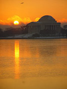 b.
b.  c.
c. 
The first and last images are warm and cool respectively, which creates
a certain mood, and in the middle is some mix of warm and cool colors
that creates some tension and contrast. Though notice that the warm color of the log is atop
the cold of the sky and snow. The eye considers the warm colors atop the colder ones, and
the oposite position could confuse the viewer.
![[end of the text]](http://www.romanzolin.com/img/misc/text_end.png "End of the article")

- Font size:


