Wedding Album - Part 2
Here I continue the story of creating a wedding album. This article is going to cover the following aspects:
Composition, Story, Balance
So, in the Part 1 we talked about creating a template and placing a single photograph. Now it's time to add more photographs and do something about that. Let's just refresh some basics about the composition – the page (or the page-spread) should have a flow, people on the photographs better be looking into the album (to the stitch). And when put several photographs on the page, the sense of telling a story greatly increases, which makes us be more cautious about mixing images that don't fit together.
When we are telling a story, we should remember that both pages of the page-spread will be participating in the story, and their order should be in sync with the flow of events. In other words, the images on the page-spread should be like a book, which depicts the events of the wedding day and you read it from left to right. It is known that the right page of the book/album (of the page-spread) attracts most of the attention, when the viewer opens it. That's why I suggest put your accent on the right page and place the better photograph on the right part of the page spread. Such an approach sometimes creates conflicts with the flow – people on the left side photographs may look outside of the album. But there is a trick – flip the photograph, so the people start looking into the album. Though you have to be careful and watch for all the details, because some of the details in the photograph could contradict with the real life. For example, the text that is visible in the photograph could tell the viewer that you flipped the image. Or what if the very next photograph shows the same place that looks like a mirror – all objects are the same but in a reverse order?
The next we should consider is the balance between the photographs and the empty space around. It shouldn't be crowded and overall balance on the page should be somewhere in the middle or slightly to the bottom. How do you evaluate the weight of the photographs? That's a tough question, but I consider the density of the tone (dark or light) and the size of the photograph. The darker and bigger the image the heavier it is on the page. Bright and small photographs considered to be lighter. There could be one additional factor to consider – the contrast. The contrast adds to the weight, but the weight in this case more about attraction of the eye. The greater contrast the stronger the eye is pulled to the image.
Sometimes you intentionally can break the balance (as any other rules), and in such case you will create a dynamic tension, which adds variety to the album (and general appeal). But don't make it too dramatic and don't make too many unbalanced pages – it should be the spice, not the dish.
Another issue with the balance is the balance between occupied and empty space. As my father said “the page should have some air to breathe”. Leave space around the photographs in such a way that the photograph(s) wouldn't look lonely or too big and more like sprawling over the edges. Though you can easily allow the photograph to take the whole page without any kind of borders or margins, so the photograph becomes the page.
~ Top ~Two photographs on a page
I think it's time to do something instead of just chatting about the stuff. Let's create a simple page with two photographs for starters. We will begin with our design that we created in the previous article:
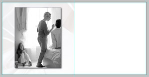
I am going to move the photograph to one of the sides of the page and add another one to the other side. To do so…
- First I select the existing image by clicking on the layer with the image and holding Ctrl key
- By pressing Ctrl-T I am switching into Editing mode, where I can transform the image
- Then I adjust the size and position of the image. Hold Shift key while changing the size to keep the proportions of the image intact.
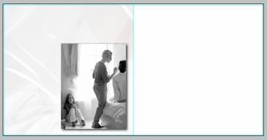 Template with transformed foreground image
Note: If you noticed the height and width of the image is bigger than the half of the page and I placed the image to the right bottom corner. You may ask why or will the second image will be smaller? Well, the next photograph I add is going to be of the similar size and it will overlap the first one. The position of the first photograph is not accidental either – the left top corner of the image doesn't say add much to the image – it's a window drape. So we can easily hide it by the next photograph.
- Add a new image to the page:
- Open the image in another window
- Drag the layer with the image onto our album page
- Transform the image and position it in the left top corner of the page (use Ctrl-T)
- I got the following composition:
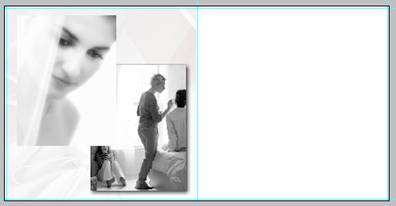 Two photographs on a page
At this point I see two major flaws: first the second image cuts the head of the girl on the photo beneath and those two photographs blend in where the white areas overlap each other. And I am going to do something about that. My idea is to crop the head shot photograph from the bottom and add the border and shadow to the photograph to separate it from the one below:
- Switch to Marquee tool (a rectangle area)
- Select the area which you want to leave in the photograph:
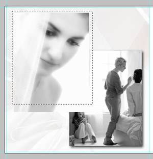 Masking foreground photograph
Note: The selection includes surroundings on top and both sides of the photograph; as well it cuts off some part of the bottom. Currently I am not concerned about anything except the lower part, so I just included space outside of the image – that way it's much easier to select
- Create a layer mask for the image – click the mask button (with the icon “
 ”) at the bottom of the Layer panel.
 - You should see the effect immediately – the lower part of the image has disappeared. And you layer comp looks something like that:
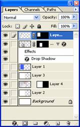 Layer panel
 - Now I am going to do the same border as the first image has. And it's very simple – just drag the layer with effects over to the layer with the image.
- After that I see that the page will benefit if we reduce the size of the images and move them slightly apart. Which is done by using Ctrl-T key combination – separately for each image.
- And here is our result:
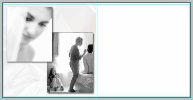 Template with two photographs
Please note that the second photograph with the head shot was selected with a purpose. The eyes of the girl lead us to the next photograph, which creates the flow. As well the photograph has lighter overall tone and feel, so the balance is shifted somewhat to the right lower corner, where the darker image dominates the page. The only bad thing here is that the flow of events is incorrect. On the left the girl is wearing the make up and her veil is on, but on the left she is only putting on makeup. But here I am showing here only the design, not the story.
~ Top ~Simple Borders
You already know a simple trick to create very simple border around a photograph – Stroke. To refresh your memory, this command is accessible through main menu Edit, Stroke. Though it works only when you have selected an area with the Marquee tool and sometimes it gets in a way, when you selected a wrong layer or try to resize or move the image. So, Photoshop allows us to do better and be less dependent on the actual image. And here are the ways to create simple borders.
Let's play with it. I will start with the following setup:
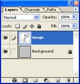
Where the top layer has the image, which is smaller than the background. So before I do anything, the image looks like this:

Stroke as an effect
Among the effects, which you can apply to a layer, there is a Stroke effect. This effect is accessible through a double click on the layer (not on the icon or the layer name) or through main menu: Layer, Layer Style, Stroke.
- Double click on the layer (to the right from the layer name) and open the dialog with layer effects
- In the dialog I activate and select the Stroke feature and set the parameters as shown below:
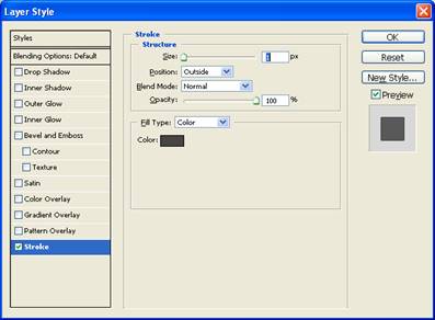 Layer Style dialog
As the result I get a simple gray border (the width is 1 pixel) and the image now looks like that:
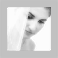
But I want to do something more interesting with it – add a gradient to it:
- Go back to the Stroke effect
- Change the fill type as “Gradient”
- The other parameters you can see on the dialog:
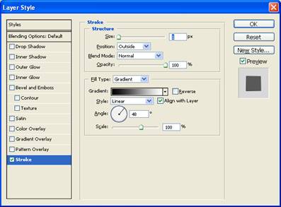 Layer Style dialog
And the image looks different now. It has an interesting border:
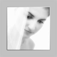
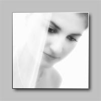
Usually I would add a shadow to better separate the image from the background, and hence I would get something like that:
Outer Glow
- Double click on the layer to get to the Layer Style dialog.
- Select and activate Outer Glow effect and specify the parameters as show below:
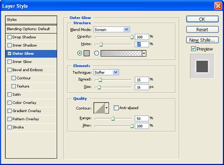 Layer Style dialog
Note: Try to select the color of the glow somewhere in between the background color and white. It will make the effect softer and the transition will be somewhat smoother. You can play with the parameters to get the effect you like. One of the parameters that can give you a different look is the Contour.
With the parameters set as in the above dialog I get the following picture:
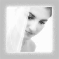
But if I start playing with the contour it gets crazy:


Bevel and Emboss
There is another effect that could work as a border, and which I sometimes use. The effect is “Bevel and Emboss” in the same Layer Style dialog. By using this effect you add a slight 3D look to the image. The image start looking as a tile, with highlights on one side of the border and shadow on the other one. The steps are very simple:
- Open the dialog “Layer Style” – double click on the layer (aside from the name)
- Select “Bevel and Emboss” and set the following parameters:
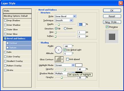 Layer Style dialog
And again, nothing prevents you from playing with those parameters and adjusting the look as you want. You may consider activating Contour effect (which is right below Bevel and Emboss).
The parameters set as above give the following look to the image:
