Cartoon Effect
After reading one of the issues of magazine "Advanced Photoshop" with a tutorial on some cool effects, I started wondering how to create a cartoon painted image out of a photograph. There are several techniques to achieve similar results (i.e. Cut Out filter, techniques that use Pen tool and etc.), but all of them either were not good enough for what I had in mind or too time consuming, like the Pen tool technique. So, after a few rounds with Photoshop I found a way to do it simpler and good enough. And these are the steps to apply this "Cartoon Painted Effect":
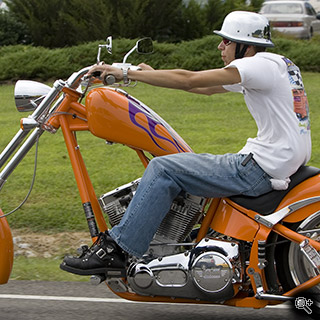
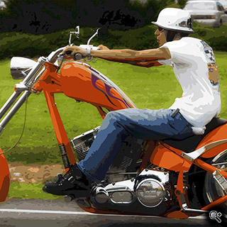
But first I want to show you the before and after images (click to see a large one):
Prepare The Image
Before we even try to do anything in regards of the effect we have to prepare the photograph. Depending on the photograph several steps could be required. if you want to apply this effect to a portrait of a person, I suggest, you retouch it first - remove the blemishes, make the skin smooth and soft. It will make it easier to apply the effect. To your liking you may want to simplify the background. What do I mean by that? Just remove as many distractions as possible. If you noticed, cartoon images are very simple, and the background there even simpler. In my example I didn't do anything about the background - it's just to show the effect. Though you may try to throw the background out of focus or make it darker/lighter, so the subject is more prominent in the photograph. And finally we have to boost the colors. Cartoons and poster usually have a more vibrant gamut of colors. And this last step I will explain here. The technique used here is just one of many, which you can use to achieve the result.

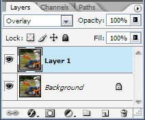
This is quite simple step. All you need is to duplicate the layer with your image (press Ctrl-J when the image layer is active) and change the blending mode to Overlay as shown on the image below.
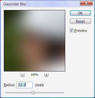
And then simply blur it with Gaussian Blur filter to make it smoother and radiant.
And finally simple merge the two layers in one - Ctrl-E.
Note: You may want to increase the contrast and make the image lighter to even further saturate the image. A simple exposure check with Levels is always a good idea. ~ Top ~Get Your Colors
You know, Photoshop already has built-in mechanism to do most of the job for us. It may not be so obvious, but let's try to remember how color-rich pictures look in the GIF format? Posterized. And it's the basis of our effect - we simply use this approach for a different need.
Indexed
Now when the photograph is ready to be converted into the cartoon-like picture, the first thing we do is change the mode into Indexed: go to main menu Image, Mode, Indexed. If you haven't merged the two layers you will be asked whether you want to merge them - click "Yes" and proceed.
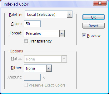 Photoshop will display a dialog with several options that will affect how your picture will look when indexed. By default it will look differently than the one on the left. I played with the settings and this combination seems to be the best for my needs and the picture I have. I would recommend that you try it on your own and see whether you like the effect it produces - the preview checkbox should be toggled on.
Probably the most important setting in this dialog is the number of colors. My thought here is that you should adjust the number of the colors based on your subject and the effect you want to achieve. The more colors the more gradations you will have in the photograph. And it may not be that simple - if you subject has very fine gradations of similar colors, like a face, then you may need more colors than expected. Just play with it and see what happens.
We need an Action
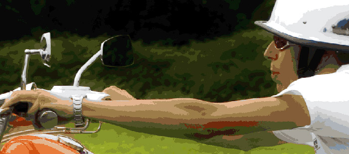
When indexed the photograph already have some similarity with the cartoon drawings. The only big difference is the rough edges of the colored areas, the cartoon drawings don't have those. And that's our most time consuming task here. Also you may have noticed that colors are not quite right. The shadow areas of the arms (and some other areas also) have a green cast, which actually dominates the image. We will fix this in the section "Little Fixes".
To make the edges of the colored areas smoother we need to create an action that will expedite the process by eliminating routing steps. Go to the action panel, create a new action (give it some name, I called it "Smooth fill") and start recording the following steps:
- Go to main menu: Select, Color Range (the dialog will appear),
- In the dialog ensure the following settings: Select "Sampled colors" (dropdown list), Fuzziness is 20
- The click on the image to pick a color (start with the most prominent one)
- Click OK to close the dialog
- In main menu choose: Select, Modify, Smooth
- Set the Sample Radius to somewhere between 3 and 5 (depending on the size of the image, mine was set to 4)
- Click OK
- Press Ctrl-Backspace - it will fill the smoothed selection with the color you picked
- Remove the selection, just press Ctrl-D
Now you can stop the recording of the action - you are done! If you had problems with it, here is my  "Smooth Fill" action
 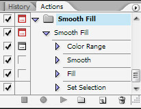 that you can try. To load the action - go to Action Palette, click that small round button with a black triangle in the right top corner of the panel, select Load Actions and choose the file you downloaded.
There is one little detail left. Expand the action to see the steps within. You can see there is a small icon of a dialog on the left against the Color Range. Click there to toggle it on. When toggled on during the performing of the action Photoshop will open the Color Range dialog and you can adjust the values.
~ Top ~Routine Smoothing
Have you noticed the effect the action has created? It made the edges of the selection smoother and removed some speckles within the selection. Now you need to repeat the same steps with the action in mind:
- Run the action, the Color Range dialog will appear
- Pick the color
Note: You can repeat the operation on the same color multiple times to make it smoother (or change the sample radius altogether by clicking twice on the Smooth step in the action and changing the setting - Click OK and review the result
- Repeat from the beginning until you are satisfied
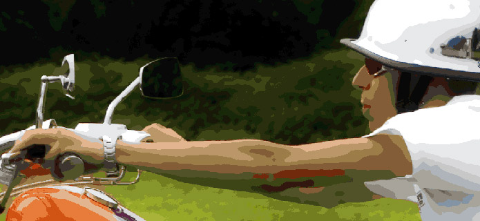
It shouldn't take that long for you to go over all the colors (or at least the major ones). The good thing about such approach is that each time you run the action, you adjust ALL the colors in the image, and there are only very limited number of those. It took several minutes for me, and actually was somewhat fun.
Little Fixes
At this point you should have almost finished picture. There is only one problem though as I mentioned before - some colors are wrong. Like the colors in the shadow areas of the arms, which are dark green instead of warmer skin colors. Such color difference is easy to fix. First change the mode from Indexed to RGB: in main menu select Image, Mode, RGB. If you want to preserve the effect we've created so far, create a new layer and do the following changes in the new layer.
- Make sure that nothing is selected in the image
- In main menu choose: Select, Color Range
- Click with the eyedropper on the color you want to change. In my example it will be the shadows of the arms.
- Click OK to close the dialog. The selection of the wrong color will remain.
- Switch to a Brush tool (press B)
- Pick a color you want to have instead of the selected one. You may hold Alt and click over some of other colors that are already in the image or use the color picker.
- Paint with the brush over the selected area
- Remove the selection by pressing Ctrl-D
- Repeat the steps for the other color
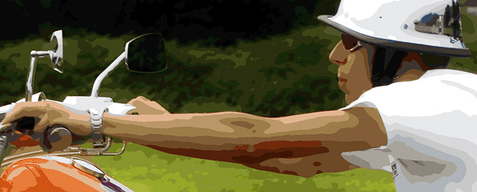
And this little color fix concludes the tutorial. Just to remind you that you have two parameters that primary affect the final result: number of colors when you switch to Indexed mode and the Sample Radius. The first one sets the steepness of the color gradation, the other one controls how smooth your areas will be. Be careful with the smoothness, some areas could lose the details. ![End of the article [end of the text]](http://www.romanzolin.com/img/misc/text_end.png)

